Breadcrumb Navigation Tips to Make Your Site Easier to Navigate
If your site doesn’t have a hierarchy, and there are only a few pages, a breadcrumb trail isn’t necessary. But if your breadcrumb design is a good idea, it will make it easier to navigate your site. Read on for tips to improve your breadcrumb navigation. And don’t forget: don’t make your breadcrumb navigation too large!
Don’t make your breadcrumb navigation too large
When designing breadcrumb navigation for your site, keep in mind that it should be minimal, not dominating the design of your website. For example, if you’re using a mobile-optimized site, you should minimize the breadcrumb trails on mobile to avoid confusing your visitors. Instead, make the breadcrumb trails as short as possible, and use a color that matches the rest of your website.
While best practices say that breadcrumb navigation should be placed at the top of a page, Apple defies this advice by placing their navigation at the bottom of the page. Apple’s users are savvy about technology and are used to the idea of having a navigation trail at the bottom of a page. Keep your customer’s needs in mind when designing breadcrumb navigation.
It’s also essential to note that breadcrumbs are not necessary on all interior pages. Rather, you should place them as a secondary navigation after the primary navigation. This is particularly true of landing pages that are linked to from multiple other pages. Similarly, breadcrumbs are not necessary on a single page that’s linked from multiple subpages. However, they can be helpful in certain situations.
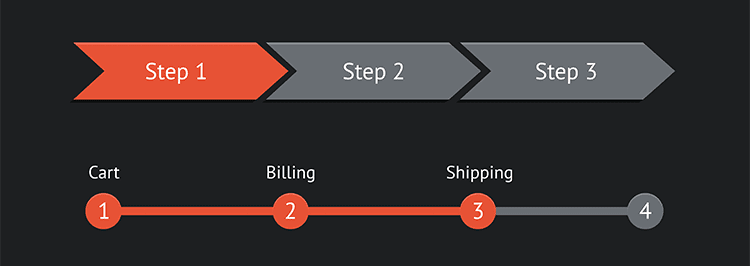
Remember that users tend to scan a page from left to right, so it’s best to place important information on the left side. To make the breadcrumbs easier to navigate, you can also use a small site logo as your homepage link. This makes the home page more distinguishable than the others. And it is also important to label breadcrumbs with page titles that correspond to the navigation.
Include the full navigational path
When creating a breadcrumb navigation bar, try to keep the text small and use a left-to-right design. In addition to ensuring readability, breadcrumb paths should show the full path from left to right. Remember, most users read from left to right, and the link that’s closest to the left will be the first in the chain.
Whether it’s a website or an app, including the complete navigational path in the breadcrumbs is a great way to help people navigate your website. Users can easily jump back to the top of a page if they’ve applied multiple filters. Using history-based breadcrumbs is particularly useful for e-commerce sites, as they allow shoppers to jump directly to previous pages.
Breadcrumbs are essential for improving the overall user experience on your website. They make it easier for your visitors to find where they need to be and are essential for building trust with your visitors. They take up a single line of design, and they improve the overall user experience. As long as you follow these basic guidelines, breadcrumbs are a great tool to use in your site’s design.
Progress from highest level to lowest
Using breadcrumbs is a great way to reduce the number of clicks required by website users to find higher-level content. These links are typically horizontally oriented, and they don’t take up much screen space. As a result, they have minimal negative effects on content overload. But how can you make sure that your breadcrumbs are properly implemented? Consider these steps.
Always make the breadcrumb trail progress from highest to lowest. To make your breadcrumbs easier to navigate, start at the top-most page on your site, then move down. The goal is to keep the breadcrumbs small and unobtrusive, so the user can easily move from one level to the next. The breadcrumb trail should not be too large, and it should always start on the homepage and end on the current page. You can include non-clickable elements such as the page title, but it’s important to clearly distinguish them from clickable parts of the trail.
Using a colon (:) to separate levels is a great idea. The colon acts as a strong anchor for users who want to see the full path to a particular page. Additionally, if your breadcrumb navigation bar shows a homepage, it will serve as a solid anchor for the breadcrumb navigation bar. It is also recommended to use ‘>’ as the separator between levels.
Get creative with design
Using breadcrumbs to guide visitors through your website can help you improve user experience. The primary goal of breadcrumbs is to make the information that is packed in them as easily as possible to understand and process. That is why they should be highly readable, not decorative. Make sure to leave plenty of space between each breadcrumb element to make them easy to read, visually separate, and click.
Another way to get creative with breadcrumb design is to display a product’s attributes. If you have multiple categories for a product, it may be best to include a product category. Also, make sure that the breadcrumb design is reflective of the typical user path. Breadcrumb design should mimic a typical user journey to avoid confusion. For example, breadcrumbs should appear at the top of a product category page, so that visitors can see which products are available in that category.
Another way to make your breadcrumb navigation more effective is to incorporate the page title. This way, users can instantly identify the page they’re on. You can also use color to distinguish non-links from links. The more distinct the link, the more likely people will be able to find it. However, if you don’t include a page title on the breadcrumbs, you’ll need to provide a link to it.
Keep it clean and uncluttered
Your websites design should be easy to navigate, and you should avoid using too many different menus. A traditional breadcrumb navigation is a good option. But there are also variations that may appeal to different audiences, or simply look better on your site. Target, for example, uses a breadcrumb navigation on its product pages, but it combines “/” symbols with simple black and grey text for more visually pleasing results. Although this variation may not make as much sense to your audience, it makes a lot of sense to maintain the aesthetics of your site.
Know your audience
You can make your website more navigable by understanding your audience. Knowing who you’re talking to will help you decide what’s most important to them and what doesn’t. It will also help you figure out what features you need to include on your site. For example, you might need an email sign-up system or an event registration system. However, your audience may not necessarily need all of these features.

