8 Web Design Tips to Make Text-Heavy Web Pages Worth-Visiting
Regardless of whether your website is for personal blogging or for business purposes, surely, you use it to convey your message to readers and clients, your site visitors. Clearly expressing thoughts and expounding statements online are usually accomplished through texts, so your written content must be indeed valuable. However, the common error of website owners in this matter is forgetting how to make their heavy text work well with their goals as a blogger or entrepreneur. What’s wrong with filling your web pages with text, text and text all over? People get sick of them! If you want to prevent or get rid of this issue from your own website, polish up on your web design!
The usual tendency when visitors land on text-laden web pages is that they don’t stay for long or don’t even try to scroll down with interest. To be honest, most people hate such a sight! It annoys them and makes them feel tired just by the looks of those web pages.
The problem is that more often than not, you really cannot avoid putting in so much text content to your website, especially when your niche or services require it and when you’re going for ranking. The solution? Being wise with your web design!
Good web design can make magic happen to the burdensome text quantity in your website. People won’t even notice that you’ve been bombarding them with information when your web design is actually making things work out effectively! Make a website that’s not simply informative, not merely aesthetic but both! Here are 8 web design tips to make text-heavy web pages worth-visiting!
1 – WORK ON GOOD TYPOGRAPHY.

Because the issue here is focused on text, it is so crucial to make the texts themselves be a key point in your potent web design. Work on good typography.
Choose font styles, sizes and typefaces that are comfortably and conveniently readable. From titles, headings, subheadings to paragraphs, make sure they are suitable to the amount of text placed on the web page.
Do not use fonts that are too stylish to the point of scaling down the clarity of words. Bold typefaces should be used for titles and certain lines you wish to highlight but not on everything. They will create a heavy feel on your website if everything’s bold. Furthermore, utilize the right font sizes. Too big is not so cozy, and too small is difficult to read.
Make your typography smart, so that visitors of your site will happily pick up information and find what they are looking for from your platform.
2 – USE WHITE SPACES AS A BREATHER.

Some website owners who personally design their sites without knowing the do’s and don’ts in web design are often the people who make a mistake of stuffing their websites with excessive content. They put anything they can in every space they see, and that just makes things worse!
Use white spaces as a breather in your text-heavy web pages. These allow your readers to have time to absorb the information you give and to rest their eyes and minds from time to time. When text overwhelms site visitors, they need a zone to recharge, and that zone is a white space.
Furthermore, white spaces keep your web design organized and clean despite the loads of text placed in it. They are like web page partitions that arrange text and graphics better! Don’t allot space for white spaces, and you’ll see your visitors leave in no time.
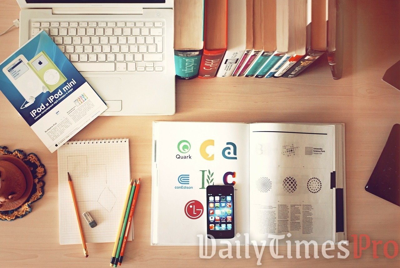
3 – ADD RELEVANT PHOTOS.

When not-so-patient site visitors see photos in between long paragraphs, their impatient minds are often encouraged by those photos to start and keep reading. If your website is surely text-rich, add photos to do the trick. Needless to say, they must be relevant and appealing too!
Use photos to make visitors visualize what your text is talking about. They will help you describe your explanations better, inciting the particular emotions you want your potential clients and followers to have.
Photos can be spaces for text, yet your readers won’t really be bothered by them because they’re a different area. Put some text on photos. They boost interest and help retain important lines from your topic.
Pictures make your website catchy also, especially when they create an impressive impact. There are many ways to edit and compile them to make them a remarkable element of your web design.
4 – PUT VIDEO CLIPS.
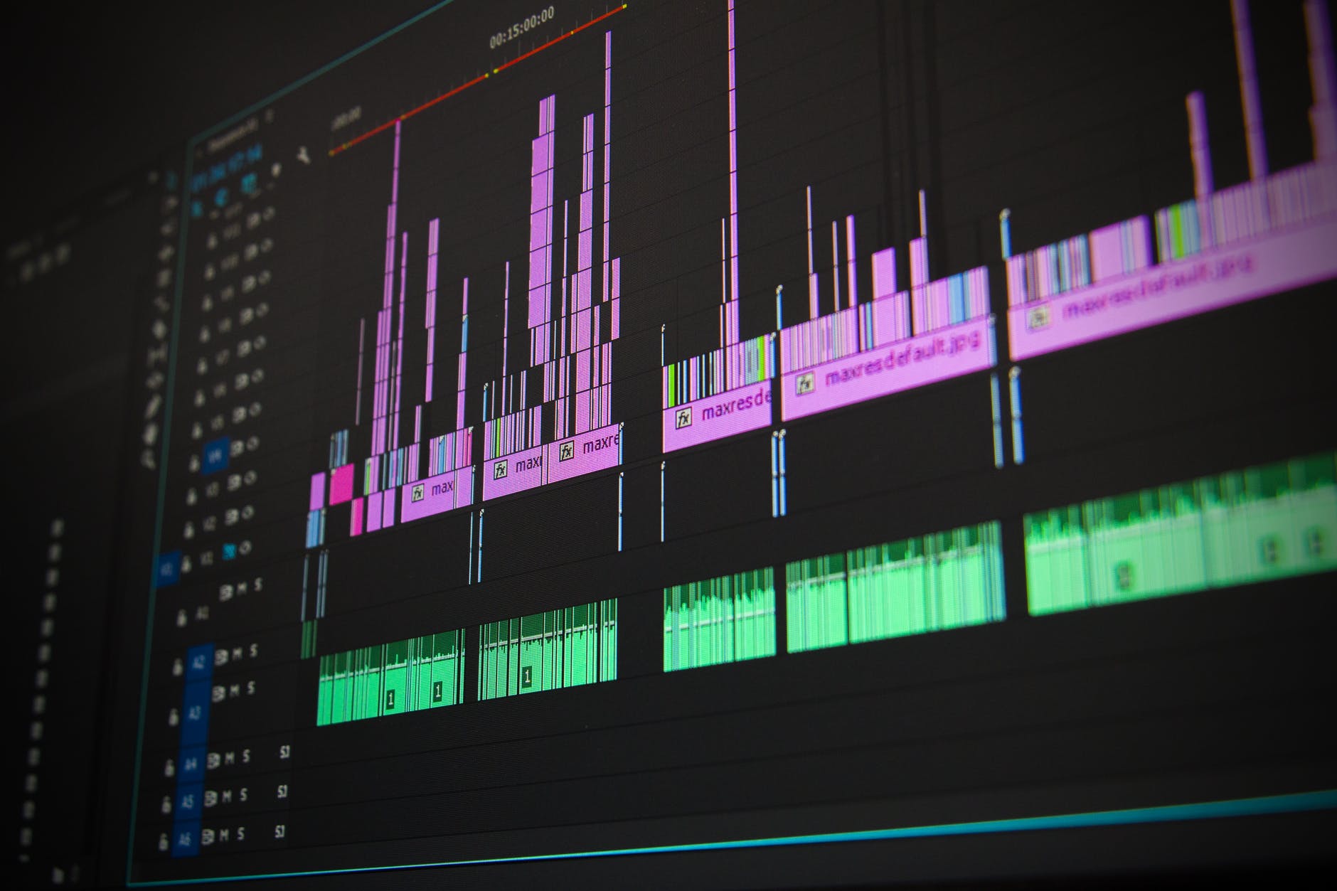
Another major form of content for websites is video content. If you can shoot, record and edit videos that are necessary or at least aidful to your business or blog, upload them to your site. You may work with ace video content creators or an adept web design agency if you can’t DIY as well.
Put video clips that are preferably not long but very grabbing and memorable. They can entertain, inform and create a wowing appeal for your brand!
5 – USE INFOGRAPHIC.

One of the most common visual tools that boosts the efficiency of web design on a text-laden page is the infographic. Use it to convey information in a creative and uncluttered manner. Illustrate your complex topics, and make them easily comprehensible through a well-made infographic.
6 – INSERT QUOTES.

Quotes are text content, but they add a different charm to web pages when they are inserted as separate chunks of text-in-a-visual content. If you have a certain quote that you want your readers to remember, regardless of whether it’s a quote by you or not, place it on a spotlight. Make its font size bigger and font style more attractive than other texts in the page. Change the background color or image under the quote to make it more eye-catching and imposing.
7 – UTILIZE ROLLOVERS.
When you can’t fit all the paragraphs you’d need to come together in a single page, you wish you can do something else aside from putting links that head to another page. Well, there’s another way, which is also the exact solution to that dilemma! Utilize rollovers for your website!
With rollovers, your site visitors will roll their cursor over to your designated image or text, and the text you indicated will appear. Whenever the cursor is removed from the surface of that image or text, the layered text will disappear. It is a productive, practical and pretty way to make a smart web design!
8 – EXECUTE VISUAL HIERARCHY.

Just because your text-heavy site is now a combination of text, photos, videos and other visual tools does not automatically mean that it will already be perfect! All these can create a disaster if you do not value visual hierarchy.
Executing visual hierarchy is substantial, so that you can help visitors navigate through your website. This is about the arrangement, organization and contrast of all elements in web pages.
You do this to let people know what’s important, more important and most important in your website. Their attention, which is very precious for website owners, will not be unnecessarily snatched by less relevant content. Even though there are so many things to see and focus on, they will be guided and lead with ease.
_____________
AN EFFECTIVE WEB DESIGN FOR AN OVERLOAD OF TEXT
Some industries don’t need a lot of words on their websites to hand out important information to their visitors, but most bloggers and businesses do! They typically cannot easily let go of their darlings when it comes to writing content into their web pages. But the list above has taught you that you don’t need to erase useful and beautiful words just to fix your text overload problem! Your web design is waiting for you to utilize its power to make things work better!
Everybody knows that summarizing or shortening already-finished text content is not a piece of cake! And it’s also disappointing once you already spent so much time and effort into making all the paragraphs for that web page, then later on, you will need to make the long story short. It’s like your energy has been wasted for nothing, and that’s just one of the worst feelings ever!
With smart and fresh web design techniques, you don’t need to sacrifice efforts or throw them away. Work with a reliable web design agency or do the designing on your own if you certainly can. Never forget: It is totally possible to come up with text-heavy websites that make visitors smile, stay and share!
_____________
ABOUT THE AUTHOR:
Nicole Ann Pore is a writer, an events host and a voice over artist. Quality and well-researched writing is her worthwhile avenue to enlighten and delight others about things that matter. She is a daytime writer for Orion Creative, a digital agency and design studio in Sydney, building greater possibilities for brands and businesses of all sorts. Nicole graduated Cum Laude from De La Salle University Manila, Philippines with a Bachelor’s Degree in Communication Arts.